10kb Apart
With the average size of a web page growing larger every year, the 2016 10KB competition challenged contestants to make a compelling web experience that delivers in less than 10KB. I entered and won the award for best design.
What I did
- Website design
- Website development
Project timeframe
2016
Planning & Wires
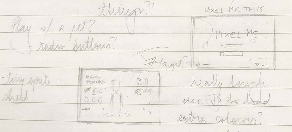
In August 2016, A List Apart published an article regarding a contest to create a web experience in less than 10KB. One of my friends sent me the link and I was instantly very interested (because I love CSS and a good challenge) and decided to try making something.
During my spare time, I have enjoyed building dress up games. So I wondered if it was possible to make one of those. Without JavaScript. At first the idea seemed laughable, because you would need some way to toggle between states.
Then I realised I could use the checkbox hack. Sure, it's a hack, but it would certainly serve for this purpose. AND it would be accessible as well, because the labels would denote what the props would be in text form, as well as visual.

Designing the Sprites
Because the entire page load is limited to 10KB, this meant that the image budget would have to be ultra tiny. I figured that using a pixel art style would be good for this, because it was traditionally tiny in size and limited in colours to accommodate the harsh limitations for images on early screens.
Here's a couple of early concepts for style:
Very quickly, I realised that these were too detailed and large. So I went back to Photoshop, changed the style to remove more details and drew some of my work colleagues (thanks guys).
Prototyping
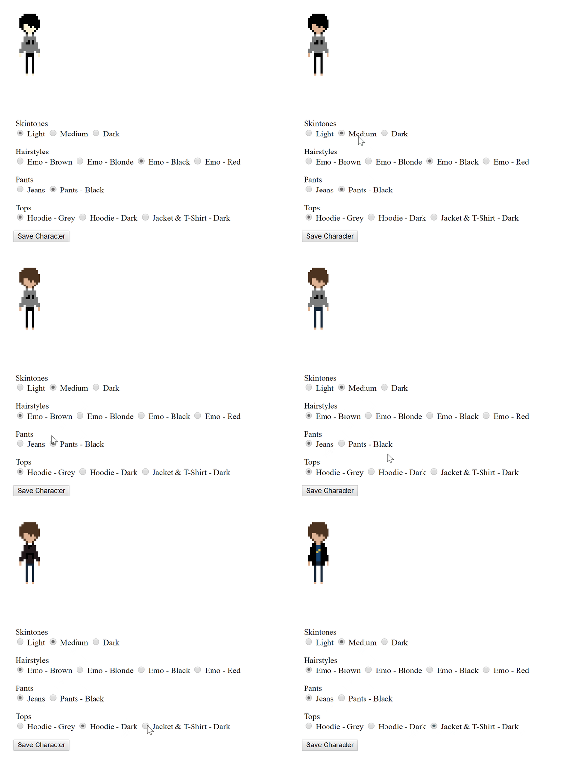
The best thing about the style is that it's very generic, so the same base body can work for different genders AND the file size is tiny. Win win! I set about building a simple prototype to test that the actual concept would work properly and get an idea for how many props I would be able to incorporate.

With the prototype working, I could now move into building the actual project. I decided to work with Sass and have the page rendered with PHP, because that would allow me to render the components using functions - honestly, who really likes copying and pasting markup around?
The interesting thing with moving to Sass and PHP is that it makes it much easier to build out your markup. It also means it’s easy to bloat said markup. Running into the issue of your markup being larger than your CSS and images COMBINED, is something I can honestly say I’ve never encountered before (╯°□°)╯︵ ┻━┻.
So I had to pare everything down. I changed the css classes to use a tiny 2 character identifiers, with prefixes to denote the type of style they were (using .t- for text based classes and .p- for props). Anything that was single purpose for design was made into an ID, because this could double as a #target for switching between views.
The result was just under 10kB, but there were only a few props, which was pretty limiting for creating a character. And up-scaling pixel art in Internet Explorer looked TERRIBLE, because I wasn’t able to set nearest-neighbour interpolation.
After exploring some ideas with SVG and realising it didn't fit the budget, things were looking pretty grim for my project. The markup was as cut down as possible, the CSS was lean and there were only a few props. What next? Oh right, I had forgotten to enable GZIP. Oops.
Refining the Overall Design
Moving back to using an up-scaled PNG image that would display relatively nicely in Internet Explorer, with GZIP enabled brought the whole filesize down to just over 5kB. YES! More props were made and the design of the splash screen was considered and quickly mocked up in Photoshop.
At this point, the project was working and mostly complete. With many bytes to spare! I showed a few people how it was going and one of the suggestions was to add a small animation when changing clothes. It’s subtle, but adds just a little bit of fun.
The Final Result

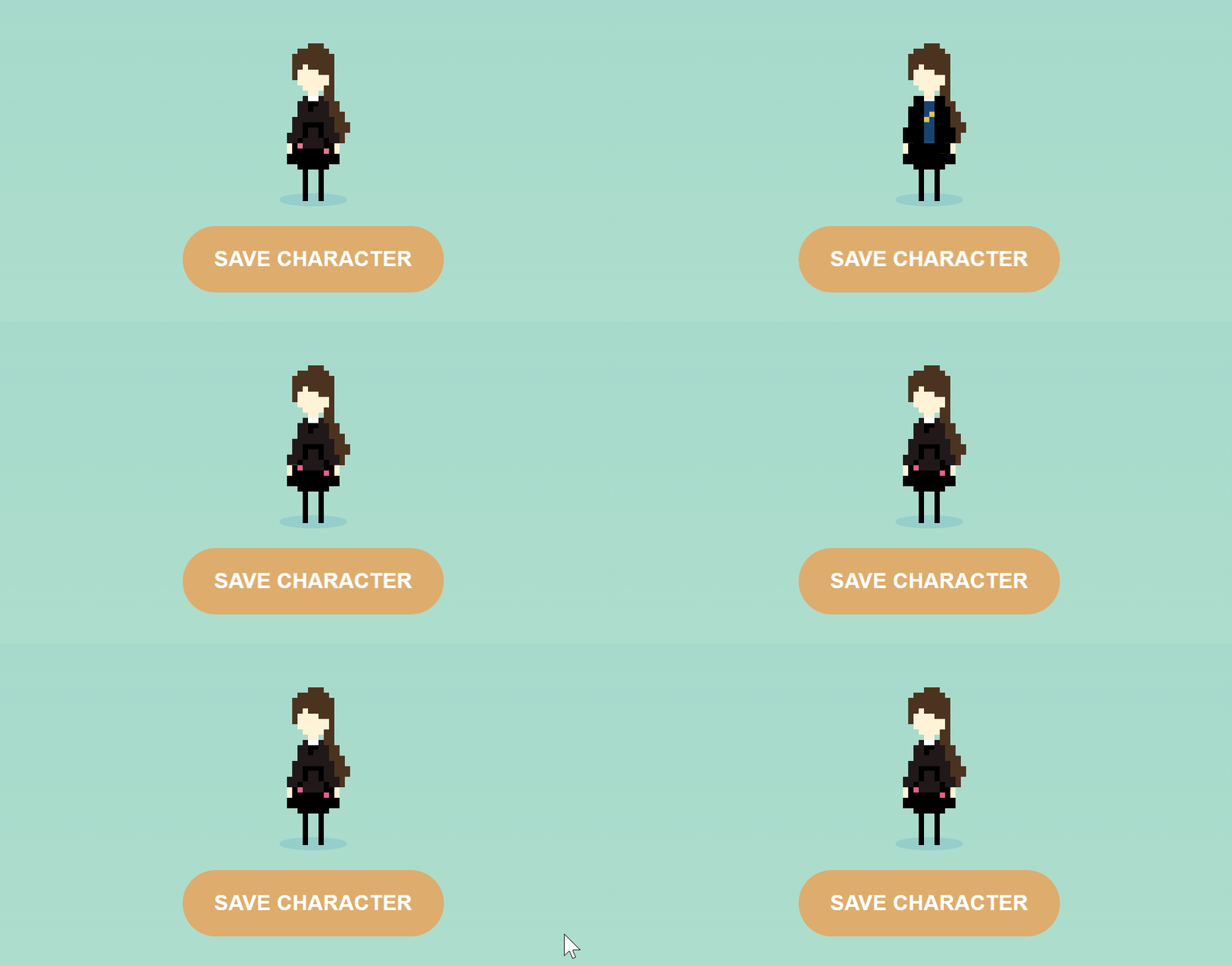
The final project outputs just over 8.1kB and the character sprites can be saved, which is all handled through PHP. And I ended up winning the award for Best Design!

It was SO much fun to build something with such clear limitations, combining several of my outside-of-work hobbies. And while several issues came up during the course of the project, each one of these was able to be overcome.
Check out the original source code on Github to see how it all works!