Chipmunks
Chipmunks are an indoor play centre and cafe that cater to children from the ages of 0 - 11. This work was completed while at Matter Solutions.
What I did
- Website design
- Website development
Project timeframe
2016
Chipmunks needed a responsive website that would perform well on mobile, with the majority of their traffic coming through on smaller screens. One of the things that was highlighted early was the need for location-specific information to be easily accessible.
Styleguide
Once the main goals of the project were defined and a performance budget set, we began the process for designing the initial styleguide and components. These were all based on the branding guidelines provided.
Colours

Buttons

Promo Block
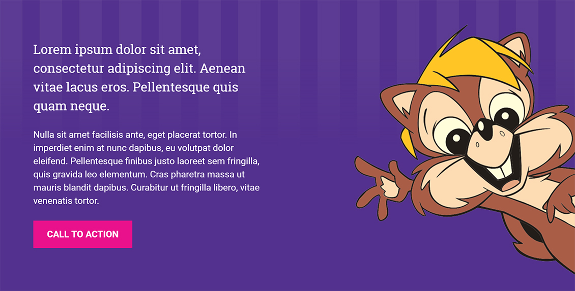
The promo block was designed to be a blocky feature to draw attention to a specific element. Text could be aligned to the left or right, with an image that would appear on the alternate side. A photo could also be placed in the background for additional versatility.

Page Layouts
Once the component designs were signed off and developed, we could easily build out the pages using the components we had defined. Together with my project manager, we discussed the main page layouts and defined them in wireframes on a whiteboard.
We set up example pages and went through training with the client, because they were to handle the content entry for this phase.

Once the content entry had been completed, we checked the final performance of the page against the original. We had cut the number of http requests in half, reduced the overall page size by 10MB (yes, 10MB) and had managed to hit all of the performance goals we had set at the beginning of the project.