Hemp Factory
Hemp Factory is on a mission to educate everyone on the nutritional, therapeutic, and environmental benefits of cannabis in all forms. This project was completed while working at Matter Solutions.
What I did
- Website design
- Website development
Project timeframe
2016
Styleguide
With the wireframes for the components completed, the next step was to begin the design system. The colours were chosen based on the branding supplied by the client and a web typeface set to match.
A sans-serif typeface was chosen for the buttons and navigational areas to ensure that the type remained very readable, even at smaller sizes. The main body of text was set in Oxygen with a type scale of 1.18.
Colours

Buttons
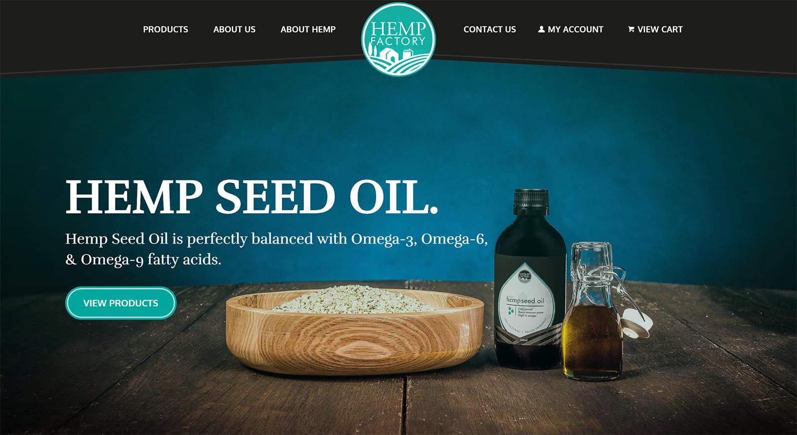
The button styles were designed to include the decorative double lines from the logo, as well as the general rounded shape.

Masthead
With the web being primarily rectangular in nature, I wanted to break the mold a little here and include a slanted header to match the product packaging. This still had to be practical, so the angles couldn't be too extreme, but it frames the page nicely and leads the eye down into the content.

Page Layouts
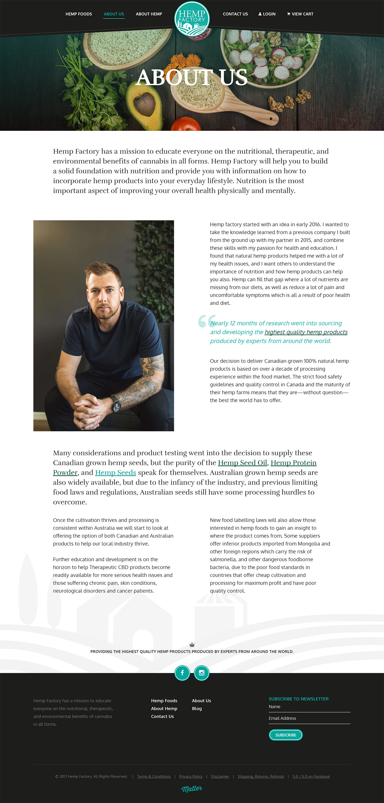
Once the components have been built, we can build out page layouts with relative ease, because we have enough elements to create an entire page. It was essential that page composition was considered at the component design stage to ensure we had heavy components, as well as components with plenty of whitespace to give the pages balance.
By setting the components up to work as Advanced Custom Fields flexible layouts, the marketing and content entry teams are able to enter content that conforms to the design rules and can build out pages quickly, all while keeping the data clean as well.
