WordCamp Brisbane
WordCamp Brisbane is a WordPress based conference that ran on July 22-23 at QUT in Brisbane, Australia, that I helped to organise, primarily working on the design aspects.
What I did
- Website design
- Website development
- Merch design
Project timeframe
2017 - 2019

Designing The Website
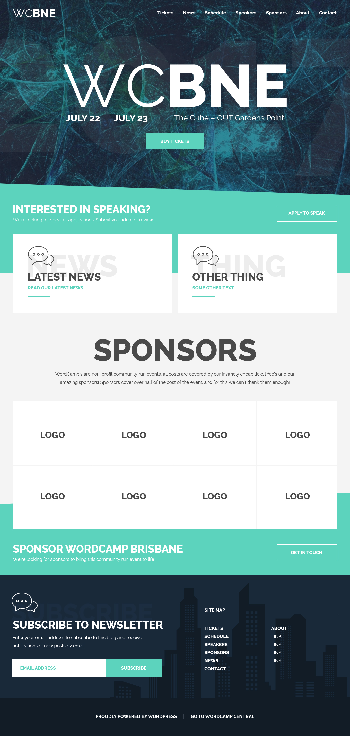
In the early stages of planning, we had to get the website up and define a design style for the conference. Because of limitations with the system in which we would be working for the website, we were only able to make CSS changes and work with the existing DOM structure.
I mocked up the initial home page design in Photoshop and myself and the team were half laughing at it being more of a design wishlist, because we weren’t sure if it was entirely possible with the existing markup. But hey, challenges are good and we were willing to try it out.
Cameron Jones and I were working on the cut up together on Github, so the development was open and we could both easily contribute to the project.
While the home page structure ended up slightly different in reality and changed over time to accommodate the changing needs of the users, the design style was translated over and we received a lot of positive feedback on how it looked.
While my initial focus was the website design, I was also able to design several other assets for print as well. These included the conference badges, the t-shirt design and signage used around the venue.
T-Shirt Design
One of the things I like about conferences are the t-shirts you get from them. However, often they're not something you would wear outside of the conference, so I went with a design that I hoped conference goers would wear while attending, as well as afterwards.
To keep the cost of printing down, we went with a single colour print and a hand drawn illustration I made of the Brisbane skyline. The little Wapuu in the middle was a recycle of the design by Kristen Symonds in line art form. We chose blue shirts for attendees, while volunteers were wearing purple, with the same design.
Conference Badges
The conference badges were designed to be minimal and only contain basic information about the attendee. We had considered adding a schedule, but because they tend to flip around while you're wearing them, we decided to make them double sided, including the users Gravatar, name, Twitter handle and website.
We also included additional information for sponsors, such as their company name and noted volunteers and organisers.